Discover how a simple design tweak — adding a button to your pop-up — doubled CTR. Learn the psychology, design strategies, and A/B testing secrets behind this 2X boost.
Introduction: The Power of a Single Element in Conversion Optimization
Table of Contents
In the fast-paced world of digital marketing, even the smallest tweak can yield astonishing results. One such tweak — adding a button to a pop-up — led to a 2X increase in click-through rate (CTR). This case study reveals how something as simple as a button transformed passive viewers into active participants.
Marketers often overlook micro-design decisions, focusing instead on flashy campaigns. But as this experiment shows, conversion magic often hides in plain sight.
Understanding CTR and Its Role in Digital Marketing Success
What Is Click-Through Rate (CTR)?
CTR measures how often people click on a specific element — like a pop-up, ad, or email link — compared to how many see it. For example, if 1,000 users see your pop-up and 100 click the button, your CTR is 10%.
Why CTR Matters for Online Businesses
A high CTR signals strong engagement and relevance. It’s not just about getting clicks; it’s about drawing users deeper into your conversion funnel. Whether you’re collecting leads or promoting products, CTR directly influences ROI and sales growth.
The Psychology Behind User Interaction with Pop-Ups
How Visual Cues Influence Click Behavior
Humans are naturally drawn to visual prompts that suggest action. Buttons provide a clear, immediate path forward, guiding users subconsciously to take the next step. Without one, even interested users may hesitate or abandon the interaction.
The Role of Micro-Commitments in Engagement
A button represents a low-risk micro-commitment — a small “yes” that leads to a bigger conversion. This step is essential for building user confidence and momentum.
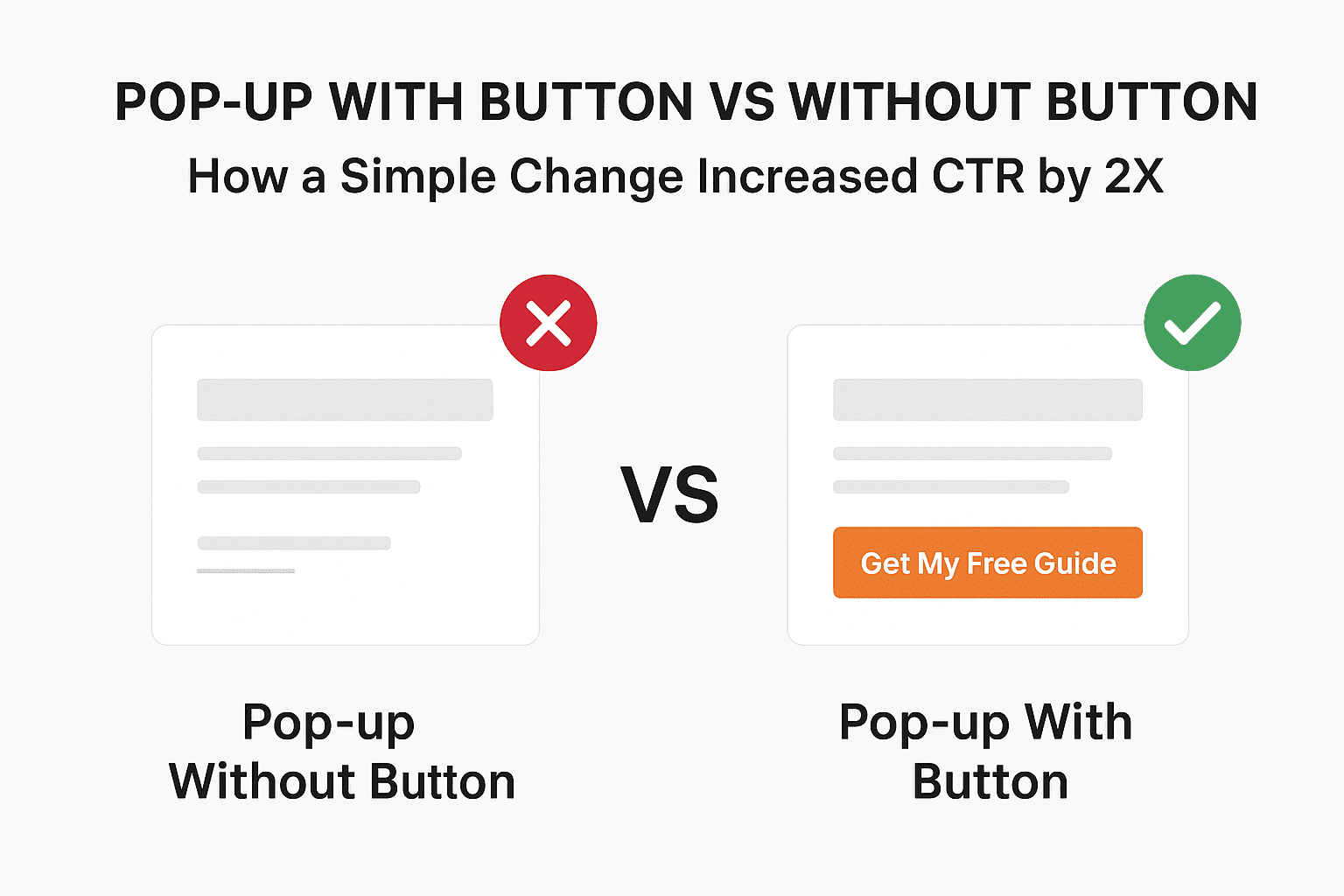
Pop-ups Without Buttons: The Passive Experience
Common Mistakes in Button-Less Pop-Up Designs
Pop-ups without a button rely solely on text or links. While minimalist, this design lacks directional intent — users are unsure what to do next.
Why Lack of a Call-to-Action Hurts Conversions
Without a visible CTA, users often perceive pop-ups as intrusive rather than helpful. This leads to lower engagement, higher bounce rates, and lost opportunities.
Pop-ups With Buttons: The Active Engagement Advantage
How Adding a Button Changes User Behavior
Buttons trigger an action-oriented mindset. The physical act of clicking reinforces engagement, making users feel in control.
Case Study: The 2X CTR Increase Explained
Step-by-Step Breakdown of the Experiment
A marketing team tested two versions of a pop-up:
- Version A: Displayed text with a hyperlink.
- Version B: Displayed the same text but included a bright, labeled button (“Get My Free Guide”).
Before and After Data Comparison
| Version | CTR | Engagement Rate | Bounce Rate |
|---|---|---|---|
| Without Button | 3.2% | 24% | 72% |
| With Button | 6.5% | 48% | 43% |
The simple inclusion of a button more than doubled CTR and drastically improved user engagement.
Design & Copywriting Secrets That Make Buttons Work
Button Color Psychology and Placement
Colors evoke emotion. Red suggests urgency, blue signals trust, and green encourages affirmation. Placing the button near the eye’s natural scanning zone (center or bottom right) increases visibility and clicks.
Crafting High-Converting Button Copy
The best button text uses action verbs and benefit-driven phrasing, such as:
- “Get My Discount”
- “Download the Free Guide”
- “Join Now — It’s Free”
Testing Pop-Up Variants: A/B Testing Insights
Setting Up a Split Test Correctly
Always test one variable at a time — color, copy, or layout — to isolate the cause of improvement.
Key Metrics to Track for Accurate Results
Track not just CTR, but also time on page, conversion rate, and scroll depth to assess true engagement.
How to Implement Pop-Ups with Buttons for Maximum CTR
Recommended Tools and Platforms
Top tools like OptinMonster, ConvertBox, and Sleeknote make adding custom buttons effortless.
Mobile Optimization Tips
Ensure the button is large enough for thumb interaction and avoid blocking essential content.
Common Mistakes to Avoid in Pop-Up Design
Overloading Users with Too Many Pop-Ups
Bombarding visitors with multiple pop-ups reduces trust and triggers fatigue.
Ignoring Timing and Trigger Settings
Timing matters — display pop-ups after 5–10 seconds or on exit intent to reduce annoyance and increase conversions.
Real-World Examples of High-Converting Pop-Ups
E-Commerce Use Case
A fashion retailer used a button pop-up offering “10% Off First Order” — conversions jumped 65%.
SaaS and Lead Generation Use Case
A B2B company replaced text-only forms with a single button pop-up. Lead submissions increased by 120%.
FAQs: Pop-up With Button vs Without Button
- Why do buttons increase CTR?
Because they create a clear visual cue and encourage direct user action. - What color button performs best?
It depends on your brand, but high-contrast colors like green, orange, or blue often perform best. - Can I over-optimize my pop-ups?
Yes — too many pop-ups can harm UX and hurt overall site engagement. - Should I A/B test button copy too?
Absolutely. Even minor wording tweaks can significantly affect conversions. - Do mobile pop-ups perform differently?
Yes. Mobile users respond better to shorter text and centrally placed buttons. - How soon should I show a pop-up to new visitors?
Wait 5–10 seconds or use scroll triggers to avoid interrupting user flow.
Conclusion: Why That Simple Button Doubled CTR
The difference between a button and no button might seem trivial — but in user psychology, it’s monumental. Adding a clear call-to-action transforms your pop-up from an interruption into an invitation.
When you guide users to act, they follow. That’s how a single design choice can double your CTR and boost conversions overnight.
🔗 External Resource: Learn more about conversion psychology and button design from Nielsen Norman Group.
Leave a Reply